GRAND SCHEME BREWING
Brand toolkit
WHAT IS THIS?
Grand Scheme Brewing was founded in 2024, with the intention of providing an alternative watering hole to the Gainesville community while brewing world-class beer. While most American breweries explore American-ness through either geographical, natural, or nostalgic means, Our brand asks the soberingly simple question: What’s more American than a good grift?
We are inspired by DIY anti-establishment movements and alternative “information” channels of every stripe. This includes home-printed conspiracy pamphlets, religious tracts, punk flyers, and all manner of spectacle and farcical pageantry.
If the “Grand Scheme” is the singular driving force behind our entire civilization’s trajectory, we seek to subvert the idea that this can even be understood by any one person. And we also make great beer.
Our tagline “Everything is under control” sums up the absurdity that this momentum is even capable of being considered as a coherent, singular force.
Ultimately, this tongue-in-cheek approach is in service to diversity, class-solidarity, and the power of community. There are plenty of low-effort movements meant to further marginalize vulnerable groups. This is not one of them. If we’re dogging anyone, it’s the nervous billionaires pulling ALL our strings.

0.0.1
Logo
LARGE LOGO
Used most everywhere, about 90% of the time. The default mark. Perfect for anything from 2 inches to 5 feet wide. Any bigger and a smaller “BREWING” subline may need to be created.
SMALL LOGO
The “BREWING” subline here is larger to maintain legibility. Perfect for printing under 2 inches, for use in email signatures, etc.
ONE LINE LOGO
When vertical space is limited, and only in contexts close to more brand touchpoints (i.e. Brew Fest tent, inside the brewery, etc)
ADDITIONAL MARKS
To be used in collages, as a signoff on web, or as a sneaky surprise on collateral like t-shirts and cans. Ideally, these should be used sparingly, and in context of the larger brand system.

0.0.2
COLOR
OUR PALETTE
Our color palette is heavily inspired by DIY print movements, and relies on the available paper colors at print shops.
Primarily, we use INK and BONE, or INK and WHITE.
Very occasionally, like on menus, flyers, and cans, we use one supporting color paired with INK.
T-shirts are the exception to this, as the colors in use there are usually quite custom.

0.0.3
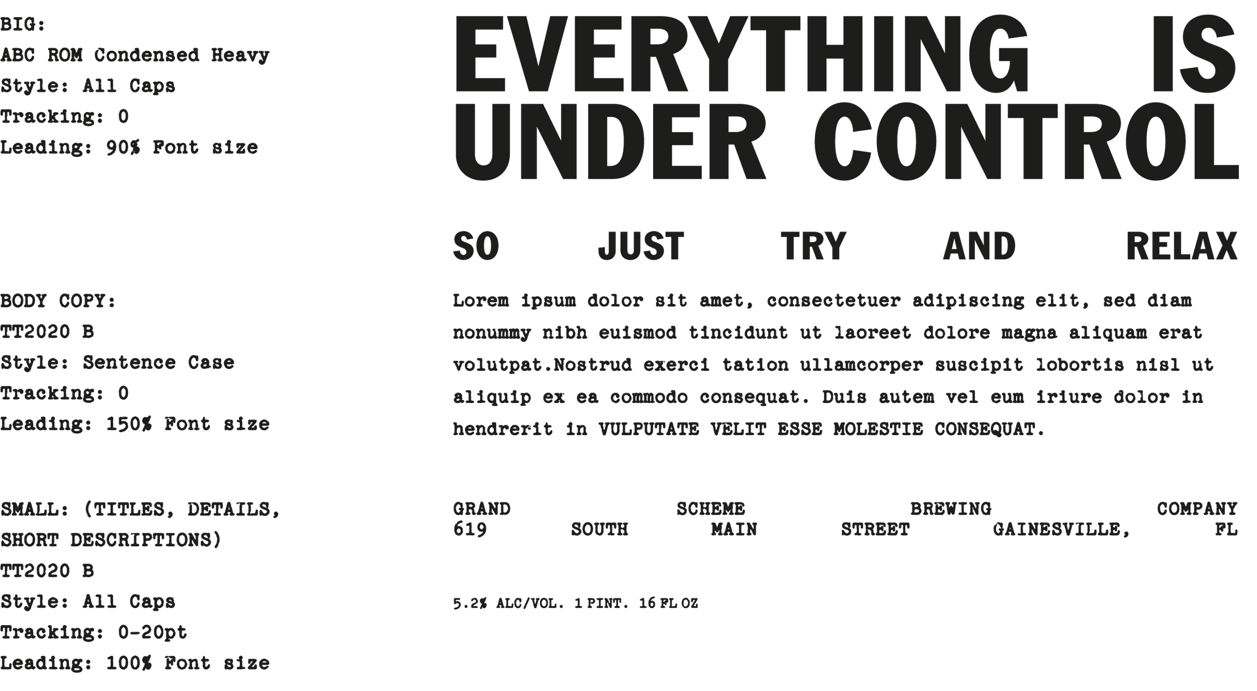
TYPOGRAPHY
ABC ROM CONDENSED
ROM, designed by ABC Dinamo, is a sturdy, confident fusion of classic Grotesk and Gothic typeface styles. It combines the rationalized lines of the former with raw details from the latter, resulting in moments both beautiful and dissonant.
ROM is perfectly suited for GSB, being reminiscent of bold, declarative protest signage and subversive print media from the 60’s and 70s.
Note: We use ABC ROM Condensed exclusively in all-caps.
ABCDEFGHIJKLMNOPQRSTUVWXYZ0123456789
TT2020
TT2020 is an advanced, open source, hyperrealistic, multilingual typewriter font for a new decade. Designed by Frederick Brennan, this font aims to replicate the irregularity of a true typewriter by alternating the impact of each successive letter, just like a real typewriter would.
Note: We use TT2020 in sentence case for very long passages of text (on web), and all-caps the majority of the time, including on Menus, instagram posts, cans, flyers, etc.
ABCDEFGHIJKLMNOPQRSTUVWXYZ0123456789
USING TYPE
0.0.4
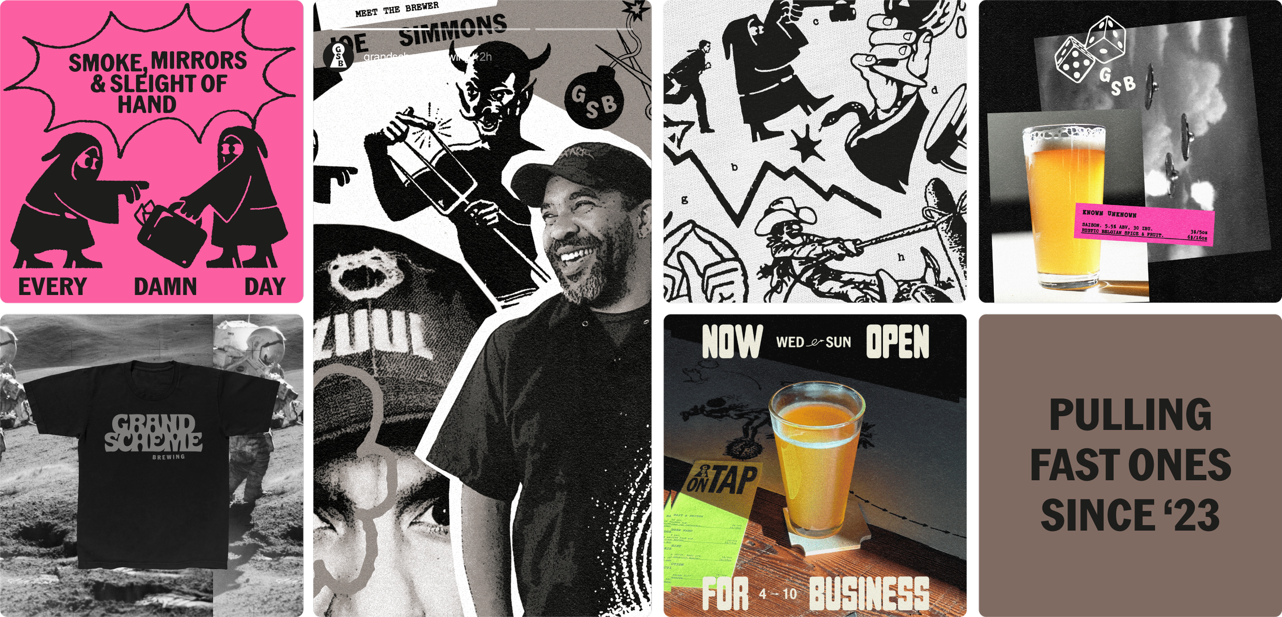
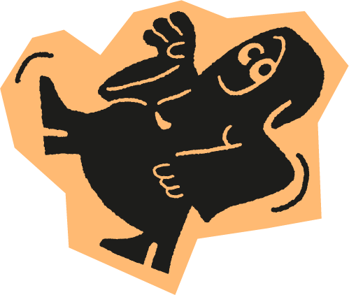
SCHEMERS
Our sneaky little mascots. These little fuckers are always getting into trouble in the background. Visually, the schemers evoke illuminati agents, assassins, the deep state, magical gnomes, cultists, etc. These little guys poke fun at the notion that “Everything is Under Control” by appearing to pull the strings from the shadows.
NOTE: We never refer to the Schemers by name in our messaging. Officially, we don’t acknowledge their existence, and think any mention of them is absurd and unfounded and we’d sure appreciate it if you didn’t bring it up again.

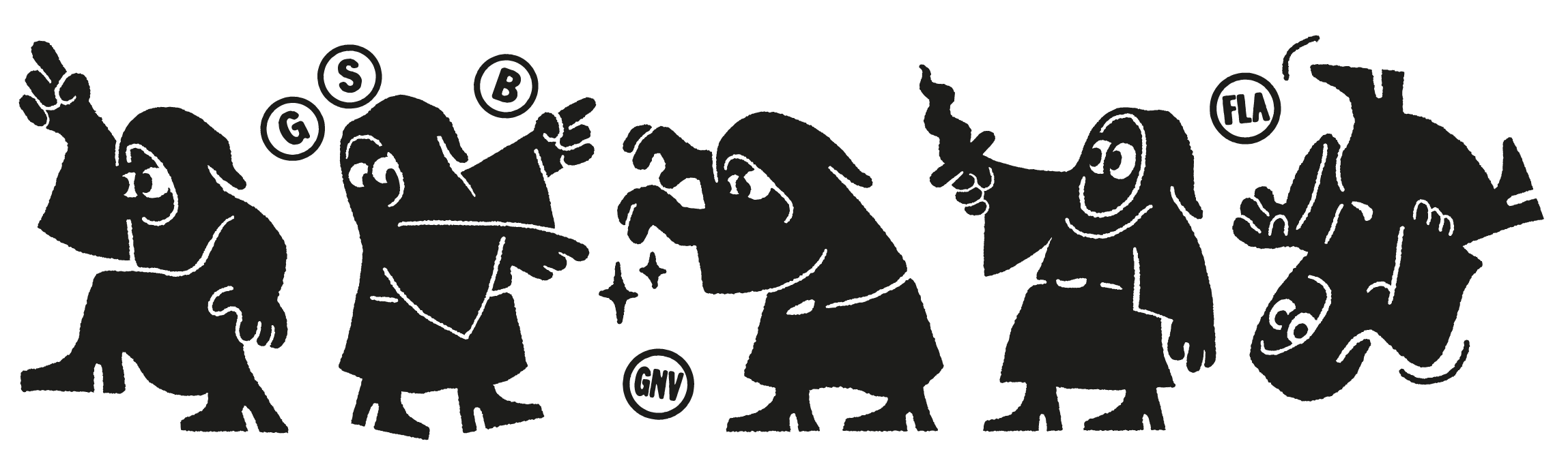

USING THE SCHEMERS
Schemers should ideally always be seen in all black, against a light or color background. If using a black background, consider using collage instead, or clip out a shape behind the Schemers to retain their dark cloaks.
0.0.5
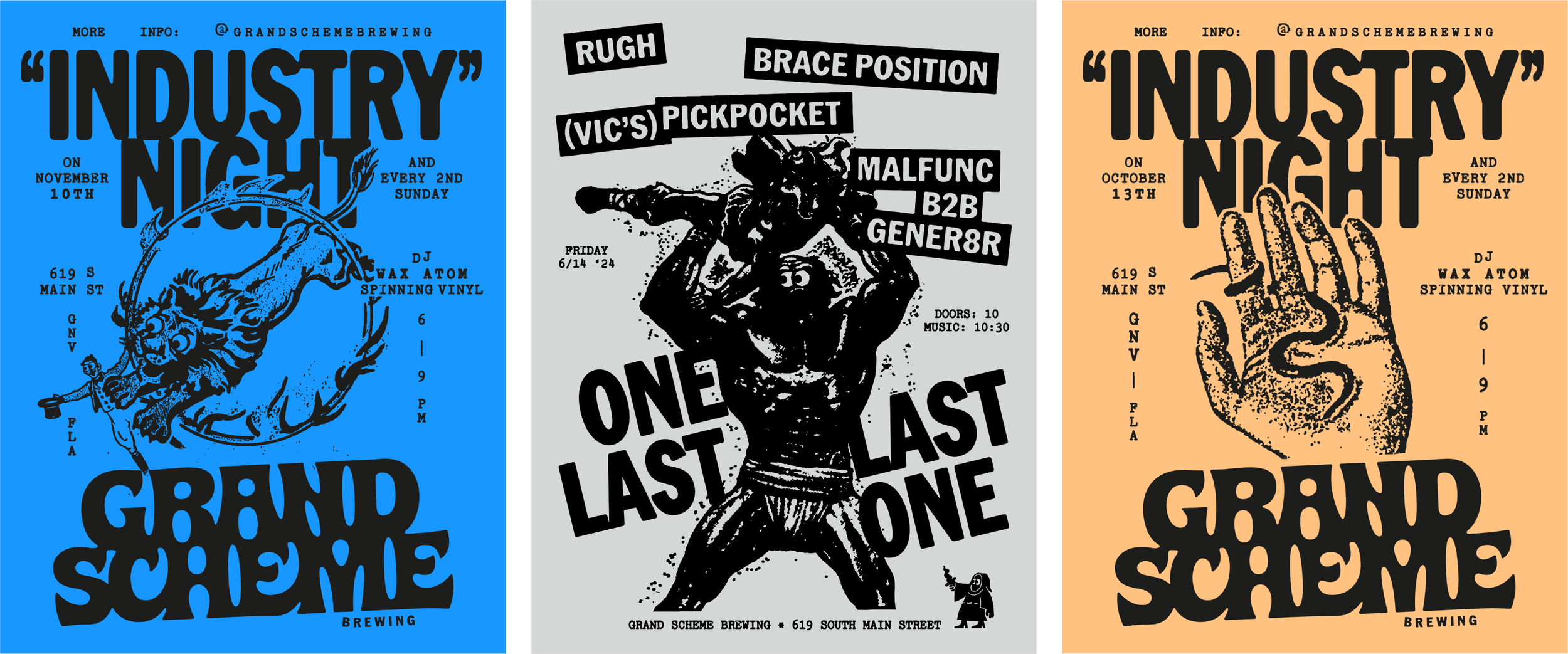
COLLAGE
We use collage when words and Schemers don’t cut it. This is great when trying to capture the depth and complexity of a universal idea, while leaving interpretation up to the viewer.
We generally opt for high contrast in collages, usually using the INK color on white, bone, or a secondary color.
Try and use open-source imagery or be sneaky when you steal it and change just enough of it to avoid suspicion. Bonus points for incorporating hand-illustration into the mix.

0.0.6
PHOTOGRAPHY
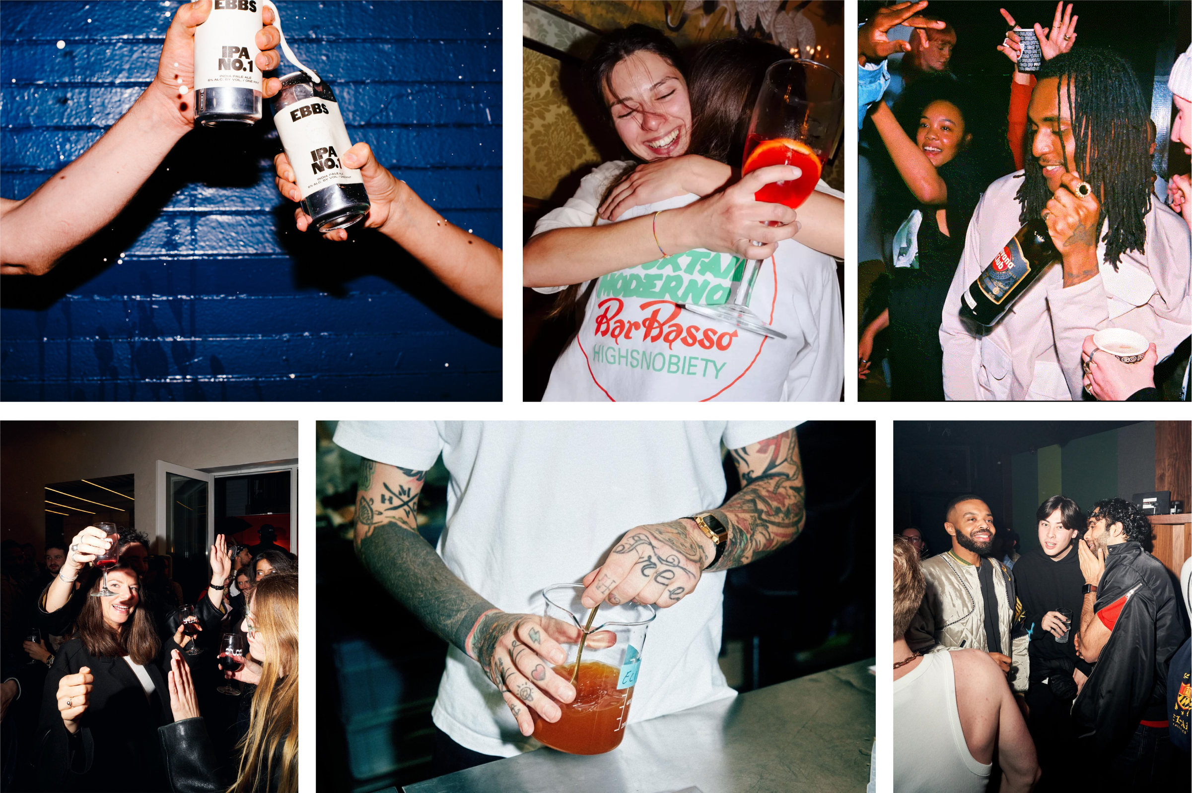
LIFESTYLE & BAR PHOTOGRAPHY
The taproom is pretty dark, so a fill flash is usually necessary. We opt for a documentarian style to our photography, embracing the rough around the edges energy of GSB. Pictures of people should feel candid and lively, never staged, and should aim to capture honest moments of novelty and joy wherever possible.
0.0.7
APPLICATIONS
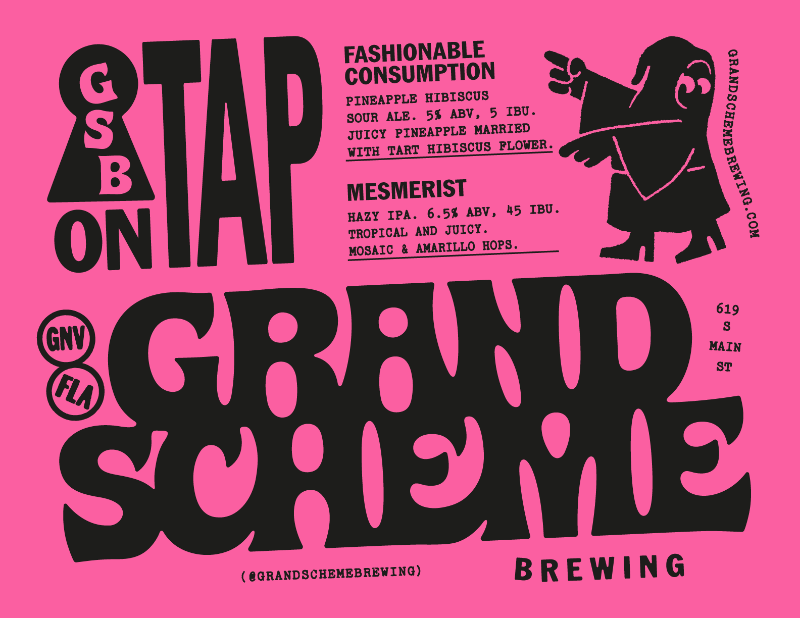
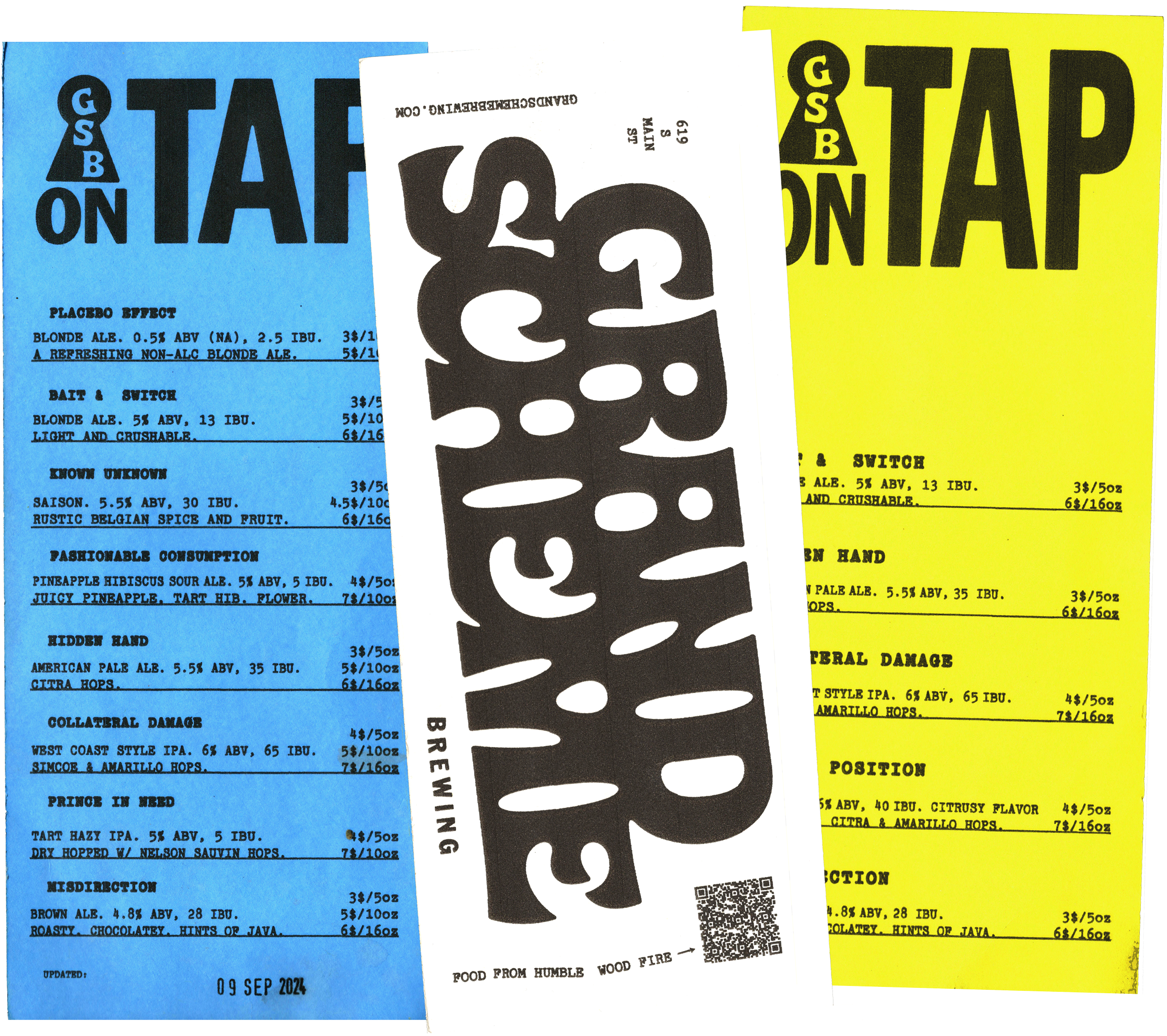
—THE MENU
The printed menu is one of the few times we use our vibrant colors in brand applications. Depending on how many beers the bar has on at one time, a different file should be used as a template. Print scale will vary, but overall, be sure to use TT2020 in all caps, and make the text as legible as possible by giving it room to breathe.
0.0.8
APPLICATIONS
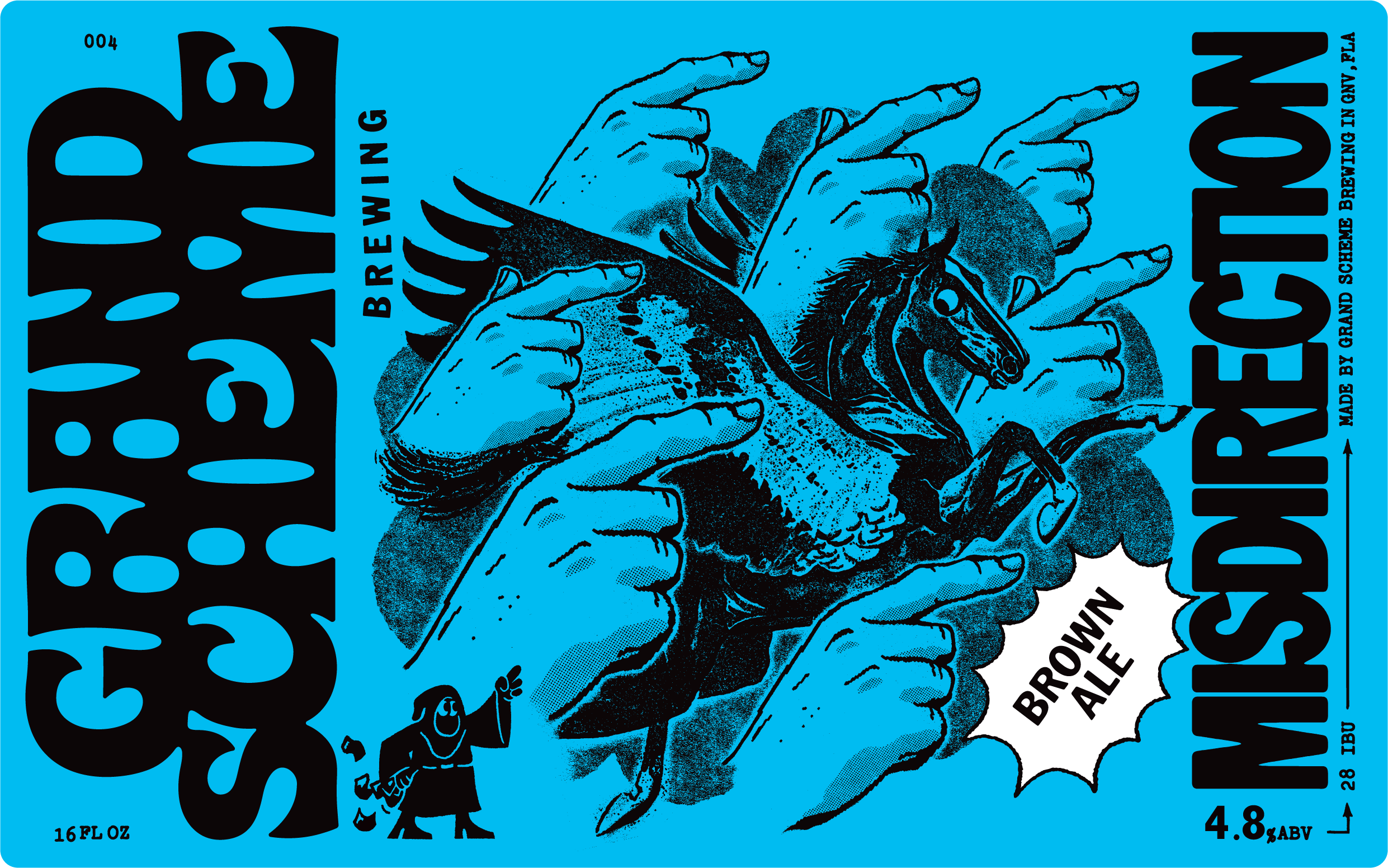
—THE CANS
LOREM IPSUM

0.0.9
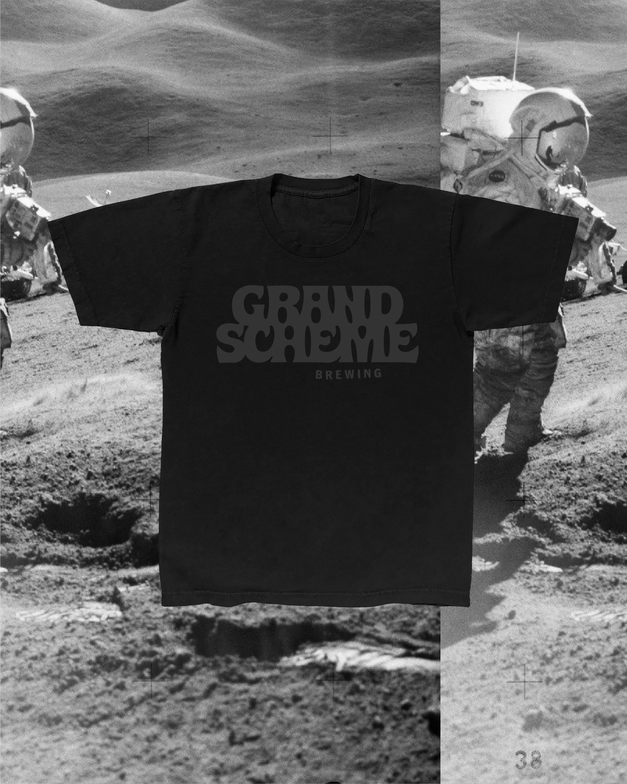
APPLICATIONS
—MERCH


0.0.10
APPLICATIONS
—GENERAL